Color Psychology: Choosing the Right Palette for Your Table
Color is never merely decorative. It shapes how we feel in a space, influences appetite at the dinner table, and even affects how restful a room feels. Understanding color psychology helps you make more intentional choices when selecting home decor.
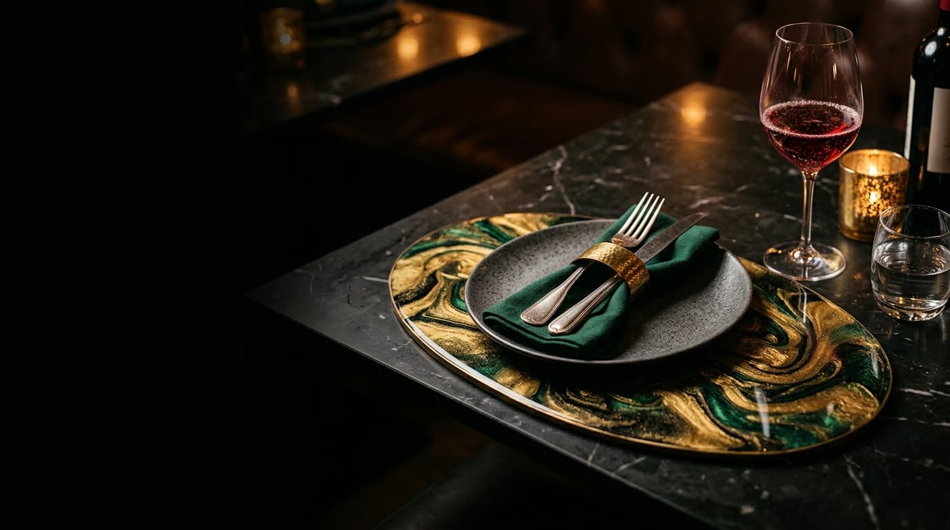
Deep blues and navy. Blue is associated with calm, trust, and depth. In a dining setting, navy resin placemats with gold accents create sophisticated tranquility. Blue encourages leisurely meals rather than rushed ones. It pairs beautifully with warm metallics, which prevent it from feeling cold.
Emerald and forest green. Green represents balance and natural harmony. Emerald resin pieces bring vitality to a table without overwhelming it. Green is one of the easiest colors on the eye, making it comfortable for spaces where people gather for extended periods.
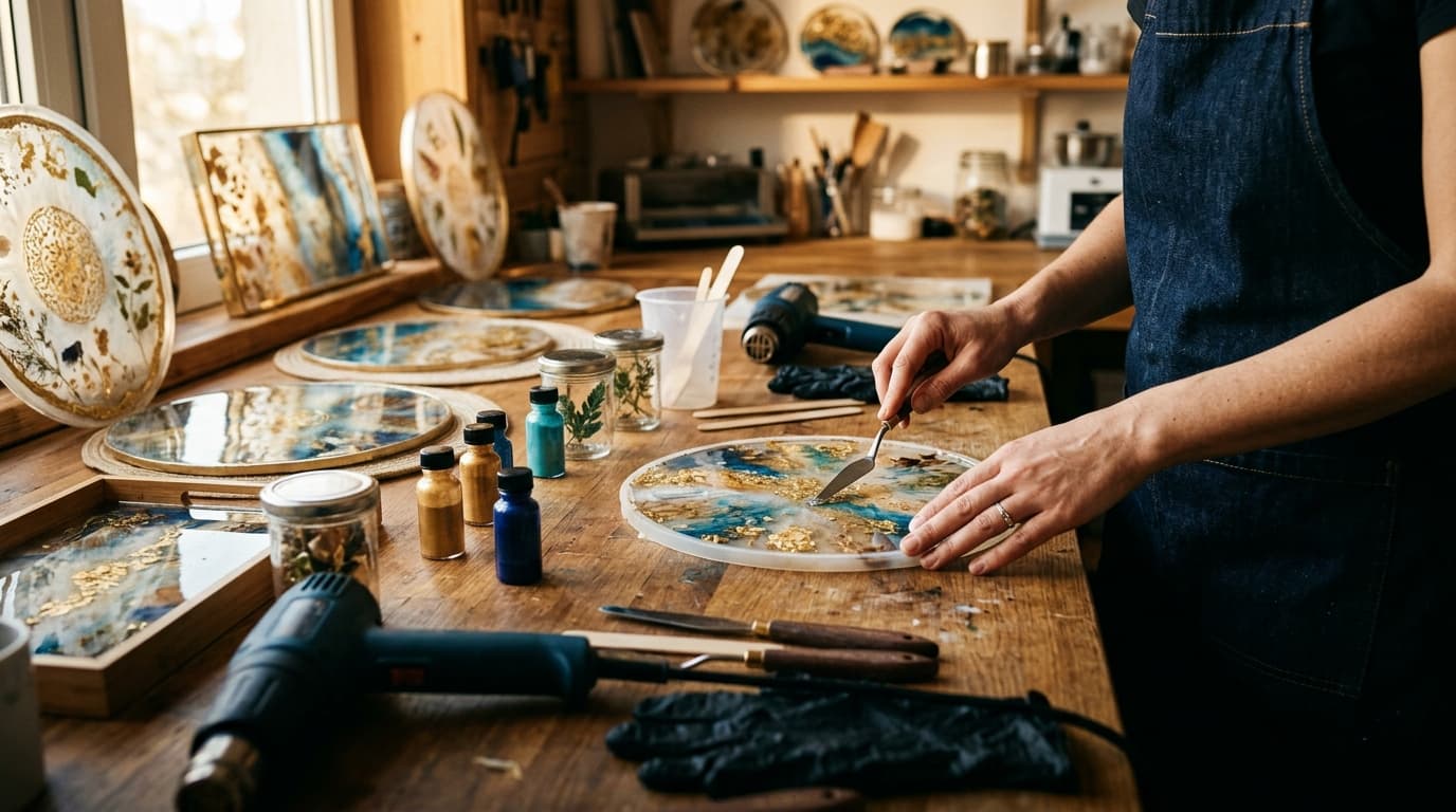
Gold and warm metallics. Gold evokes luxury, warmth, and celebration. Metallic veining in resin art catches light and creates movement across a surface. Use gold as an accent rather than a dominant tone — the right amount feels generous and inviting.
Black and charcoal. Dark tones create drama and focus attention on surrounding objects. A black marble-effect resin tray on a light surface becomes an immediate focal point. Dark palettes work best in well-lit rooms where they create contrast rather than heaviness.
White and cream with metallic accents. For understated elegance, white resin pieces with subtle gold or silver veining offer luxury without demanding attention. These neutral tones are the most versatile for seasonal changes in styling.
When selecting colors for your home decor, consider not just what looks beautiful in isolation, but how it will make you feel every day.
Written by
Daydream Studio